Terra Marie- Week 13 + 14 Dev Log
Terra Marie- Week 13 Dev Log
November 14th - November 22nd
[9 hours 50 minutes]
November 15th - 2 hours
I typed the puzzle feature in the game called “Spirit Trail.”
November 16th - 1 hour 30 minutes
I drew a concept for cover art for the game. The inspiration was to make the cover art look like a tarot card. It may need editing just in case it is not the correct size, but it was meant to just be a starter drawing to let the group know what direction I was intending.
Figure 1.1
November 17th - 2 hours
I continued to add small details to the level. Nothing major beyond adding more rocks and detailing was done this day.
November 18th - 1 hour 30 minutes
I did lighting with post-processing to make the level look more “gray.” It was the start of giving each area a different personality.
Figure 2.1
Figure 2.2
Figure 2.3
November 20th - 2 hours 50 minutes
We received feedback from the 75% progress turn-in. So, I fixed some of the levels and lighting design issues mentioned there. The group had a meeting where we discussed progress, and Daelyn and I discussed lighting and the direction for finishing the dialogue.
November 22nd - 45 minutes
Catch up on dialogue. Working on lighting in the cave.
Figure 1.1 | Cover Art
Figure 2.1 | Graveyard Post Process
Figure 2.2 | Sorrow Island Post Process
Figure 2.3 | Sorrow Island Post Process
Terra Marie- Week 14 Dev Log
November 27th - November 30th
[12 hours 15 minutes]
November 27th - 3 hours 55 minutes
I worked on writing dialogue trees for Gluttony and Selfishness.
November 28th - 3 hours 30 minutes
I made a new post-processing material to add to the sky. Because the level is literally encapsulated within a cloud of smoke, my biggest issue with post-processing was trying to change the scenery in a more meaningful way. The sky was always getting in the way of the effects I was trying to accomplish. So, I did some research on how to create different types of post-processing and ended up finding an outline material that I then customized to fit our level design.
Figure 1.1
Figure 1.2
Figure 1.3
Figure 1.4
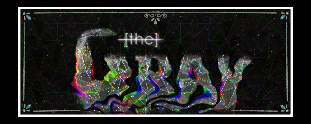
I also made a banner and background for the itch page this day, but I didn’t like it
Figure 1.5
November 29th - 2 hours 25 minutes
I had typed the dialogue that I first came up with in google docs, but I moved it over to Twine before finishing Gluttony and Selfishness.
Figure 2.1
Figure 2.2
In addition, I went back into the level and added post-process transitions so there wouldn’t be abrupt changes within colors.
November 30th - 3 hours
I finished sorrow’s dialogue and re-did the banner and background for the itch page. I think this design looks much cleaner and consistent than the one before.
Figure 3.1
Figure 1.1 - Figure 1.4 | Sky lighting changes
Figure 1.5 | Itch page first iteration
Figure 2.1 | Gluttony dialogue tree
Figure 2.2 | Selfishness dialogue tree
Figure 3.1 | Itch page final design
Get the Gray
the Gray
| Status | Released |
| Authors | daeja_vuu, TerraMarie, tweber14 |
| Genre | Puzzle |
| Tags | Abstract, Atmospheric, Casual, Mental Health, Narrative, Singleplayer, Surreal, Unreal Engine, Walking simulator, weird |
More posts
- Terra Marie- Week 15 Dev LogDec 08, 2022
- Blaise Morales Worklog - 12/7Dec 08, 2022
- Thomas W - Project Devlog - 12/7/22Dec 07, 2022
- Kevin B - Project Devlog - 12/7Dec 07, 2022
- John Sparano the grey wk 14Dec 02, 2022
- Thomas W - Project Devlog - 11/23 and 11/30Dec 02, 2022
- Kevin B - Project Devlog - 11/23 and 11/30Dec 01, 2022

Leave a comment
Log in with itch.io to leave a comment.